I needed a printed A5 flyer for Unolia. Claude did it in seconds. I took hours to refine it.
Here is the whole thing in 14 seconds, version by version:
The flyer is in French, it's for French web agencies. I made an English version later.
The first draft looked finished
I asked Claude to generate one based on my marketing site and it was done in a few seconds.
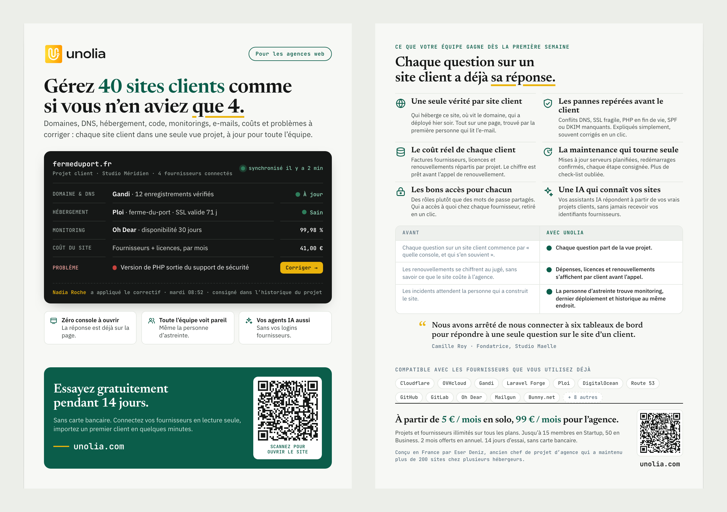
But of course it's never that easy to have good looking material content.
AI has no taste, it also doesn't understand the struggles a web agency goes through, it doesn't understand my clients.
So obviously it does what it's good at: spitting out lots of text.
The front cover
But at least I have a POC, a starting base, something to work on.
It's like visiting apartments: until you've visited a lot of them, you don't really know what your criteria are. You think you know at first, but the more you visit, the more you know.
The first step was to trim everything I knew I didn't want:
- QR code on the back
- 3 selling points on the front page
- AND SOME SPACE!!
I don't know why AI leaves so much blank space, but I always have to tell it to dial it down a bit.
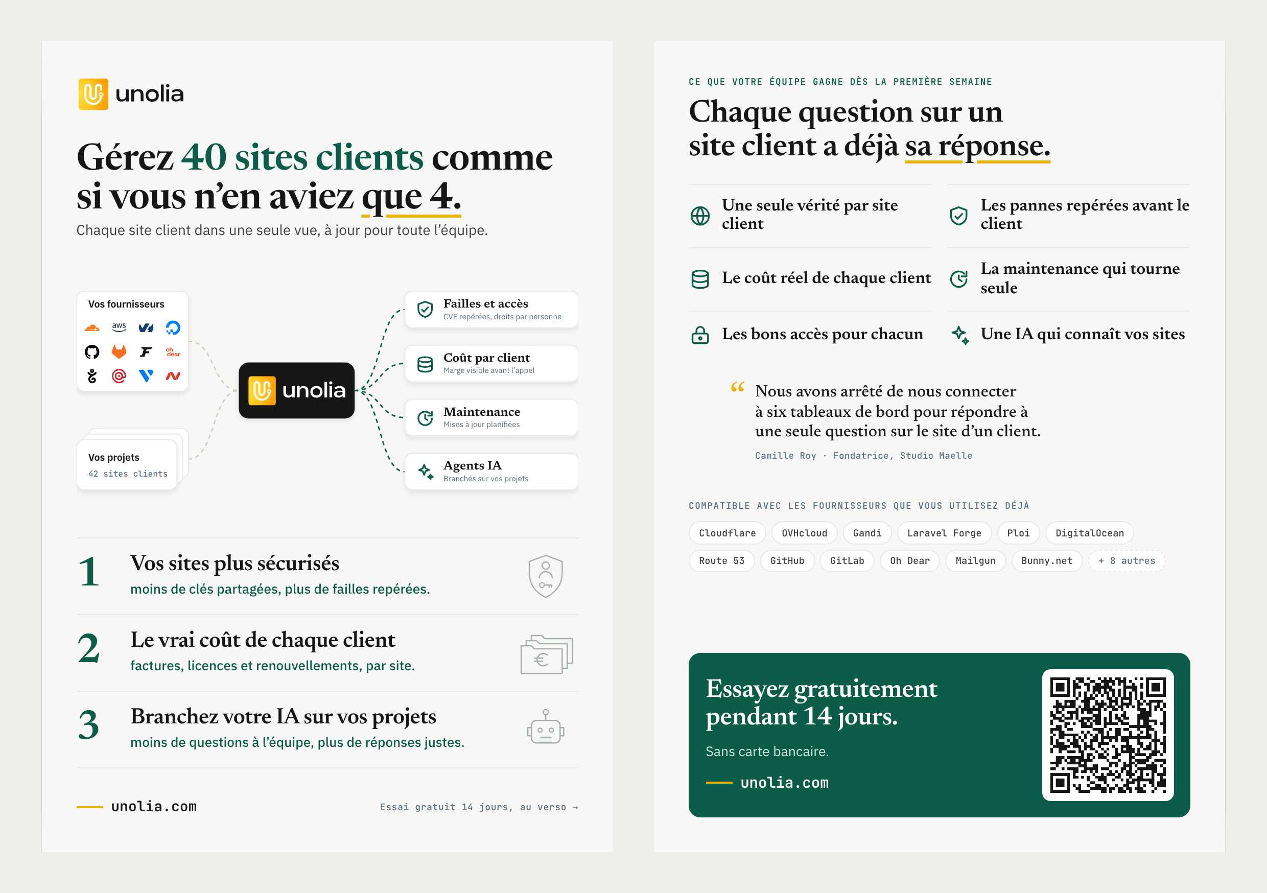
After 25 iterations, here's what I got. It's much cleaner, and it shows what I'm selling way better.
Back cover
The back took way more time.
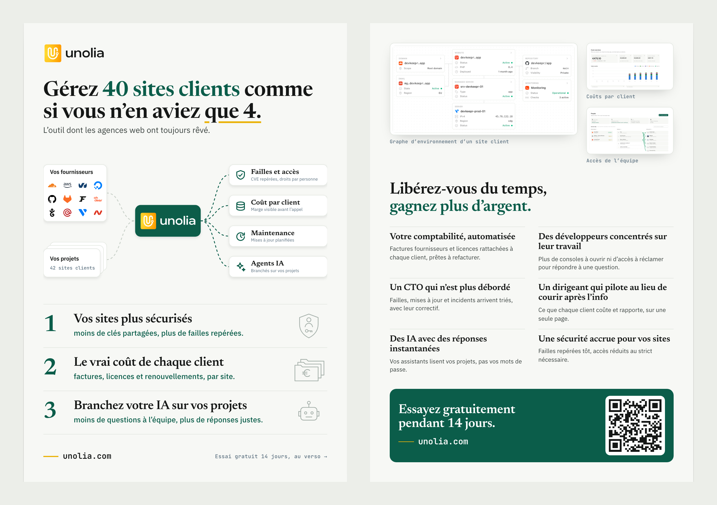
Something that is not very visible in this video is that I asked Claude for several artifacts to compare different ways of presenting the features of Unolia. I tried a table, a series of screenshots, some graphs.
In the end I decided on 3 things:
1. I want screenshots. Even if they are not very readable, I think it's important that my customers see a bit of what they can expect.
2. Feature lists don't sell. I was thinking of putting some testimonials on this flyer, but I decided to put use cases a web agency will run into and what Unolia fixes.
3. A big headline and a small QR code. A QR code is good for opening the website quickly, but it shouldn't take that much space on such a small piece of paper.
The final changes
Then there are like 20 other little changes that nobody will ever notice.
If you stop there, it's okay.
You made a fine piece of work/art. But I'm a perfectionist, so I sent it to my friends and looked at the final result for one more hour.
I took every recommendation and fine-tuned every bit:
- bigger text size
- removing the final period of sentences
- diagram icons got a thinner stroke
- graph lines opacity
- "Plug your AI into your projects" became "Supercharge your AI agents"
Basically tuning spaces, contrasts and marketing punchlines.
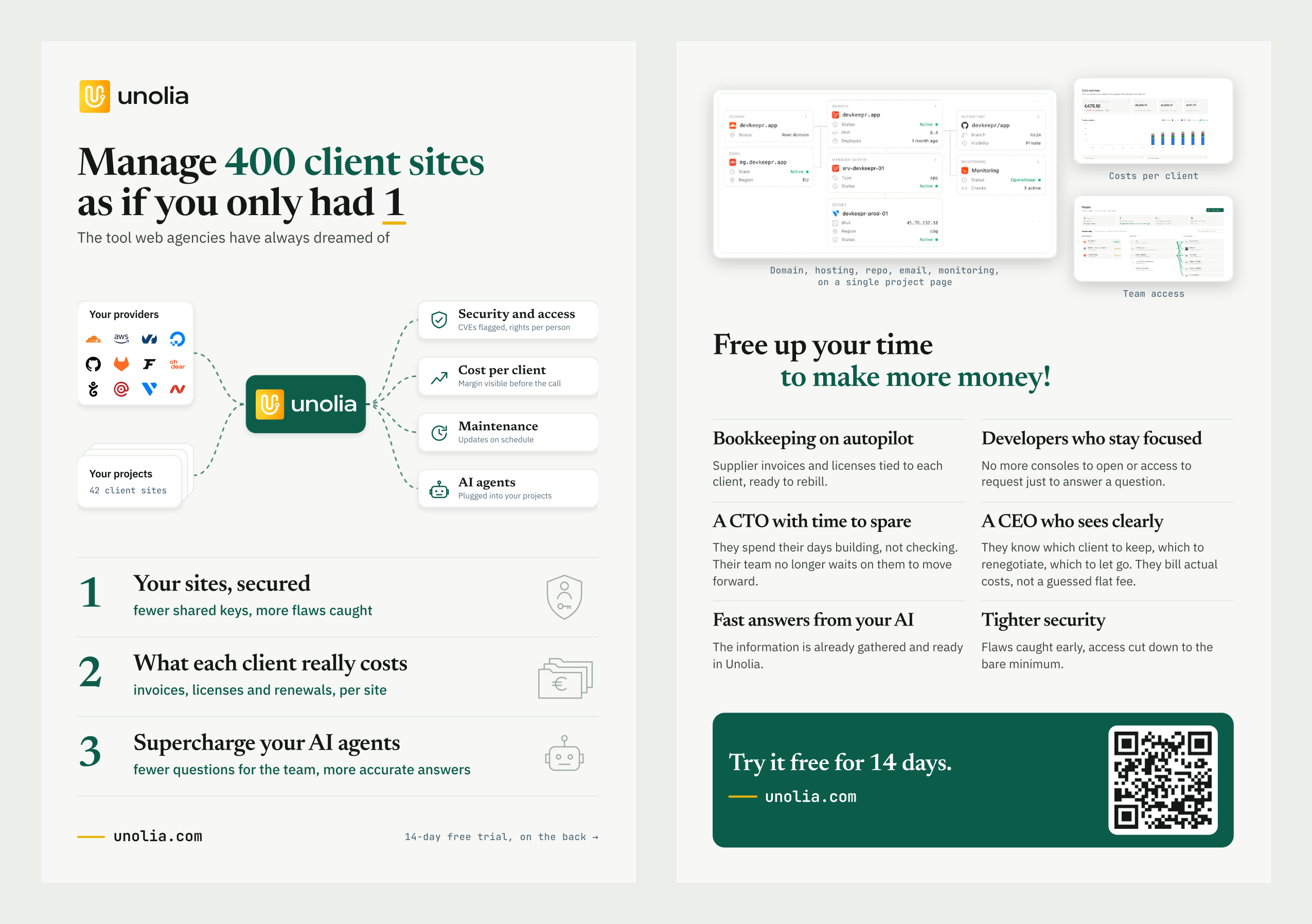
And we got the final version!
In English this time, so everybody understands:
Conclusion
AI saved me a lot of time. Without it, I would have spent days in a design tool, and I would never have tried 44 versions.
But don't be impressed by the first result done in a few seconds. It looks finished, it isn't. The good work came from the hours I spent looking at every version and saying "no, not like this".
AI makes trying cheap. Knowing what to keep is still your job.
PS: To be honest, I know that just before printing I will make even more changes. I already spotted a few things I don't like in the English translation. Another example of AI translating in one shot, but you still need taste to change some words.