After the flyer, I also redid my personal site, eserdeniz.fr. This blog speaks to developers. I wanted a site that speaks to clients.
Two days in Claude Design, 290 mockups, then 36 versions after being exported to github.
From the start, I knew I wanted a different style of website. I had imagined this homepage in my mind, and I did a good job describing it to Claude. But then I spent an enormous amount of time on some details.
25 color palettes. I ended up with navy and sky blue, plus a bit of orange for what you should click.
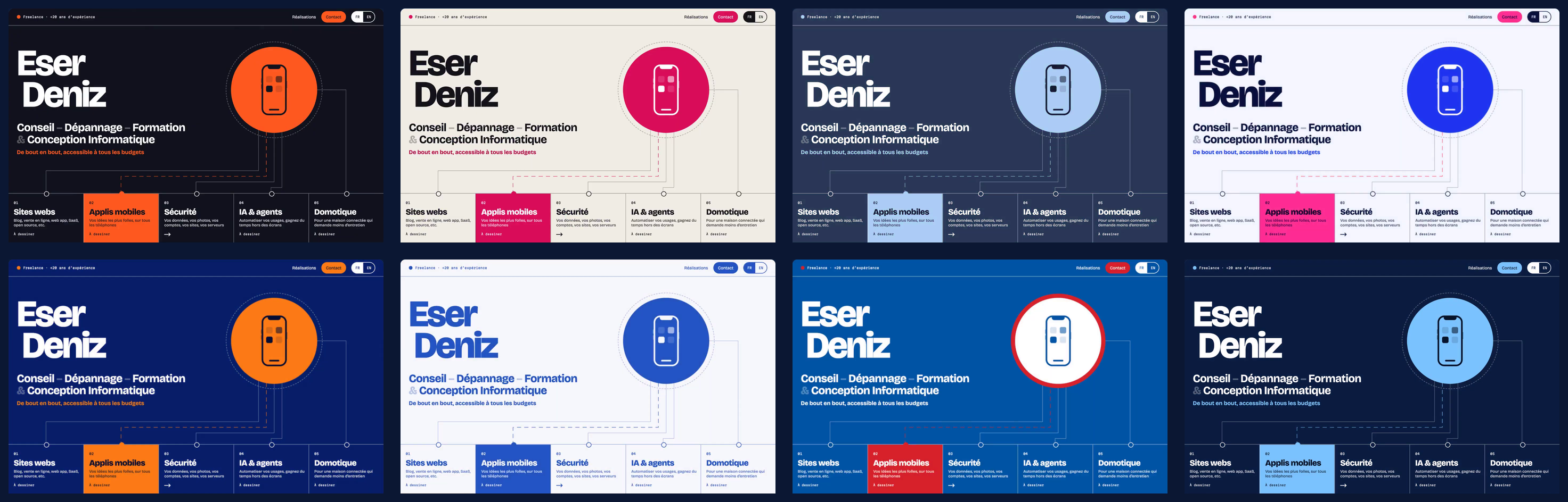
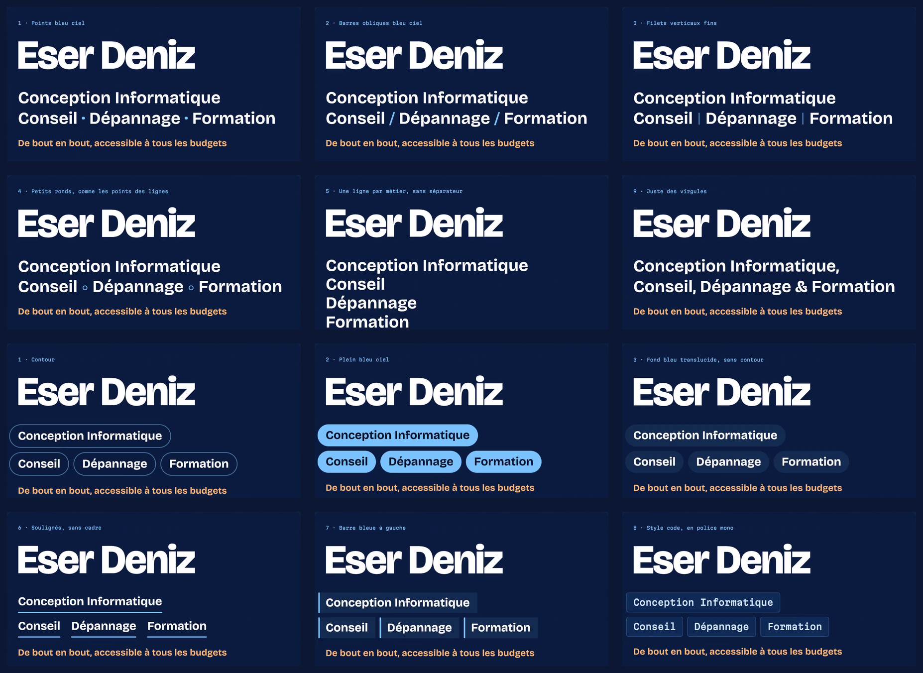
19 takes for the tagline under my name. Not the words, they never changed. Just how to show them: slashes, thin lines, one job per line, commas, pills, underlines, keyboard keys...
14 takes for one button. "Let's take stock together, free of charge" as a pill, in orange, with a hard shadow, as a keyboard key, even as a terminal command.
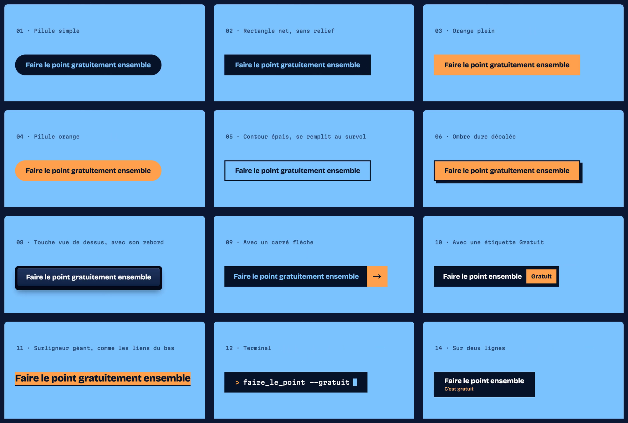
Too much for a button? Probably. But that's what attention to detail looks like.
I wanted soemhing different
One rule I had in mind: no scrolling on desktop.
I also wanted the site to move a bit, so it feels more like an app than a classic website. On a computer, every page fits the screen, no scrolling. Click a card and a colored veil grows from it to fill the screen. Go back and it shrinks into the card you came from.
I also found fun to design little 3D models everywhere: a laptop, a safe, a robot, a van, a boat... Generating 3D models is very easy today with Opus/Fable, and I'm really happy with the result.
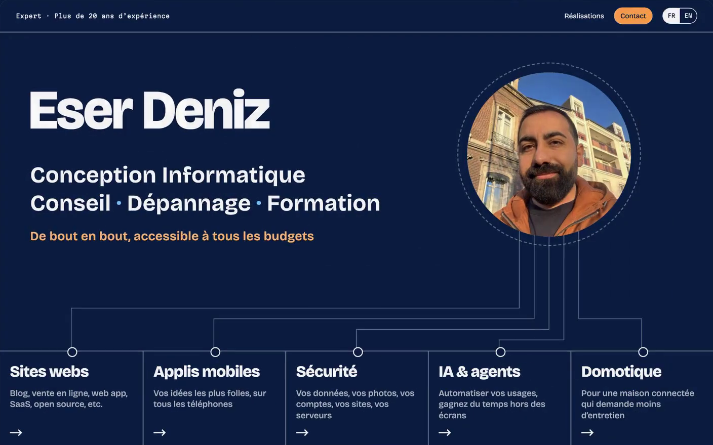
It's also my first website built with Astro. Since it's a static site except for the contact form, I thought it was worth a shot.
Why not Statamic, like this blog? I don't need a control panel. I'd rather change the content with a pull request on the repo. So I simplified the stack: no PHP at all.
It's still hosted on Laravel Forge, and it was easy. Set the build command to build in /dist and set the public directory to this directory.
I didn't explore Astro much. But it optimizes my images for me, and that's already great.